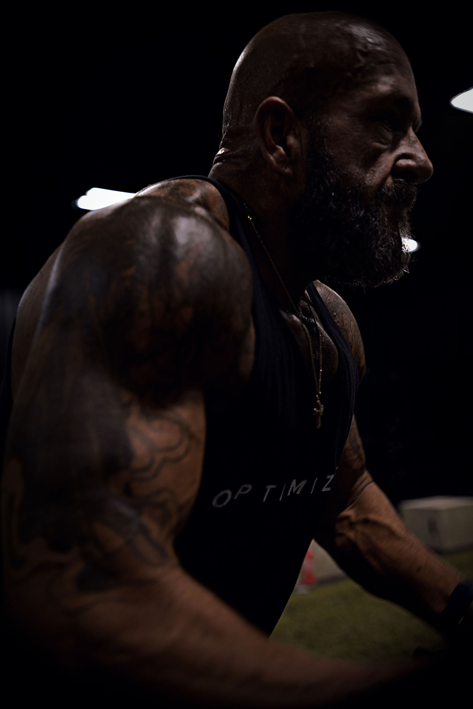
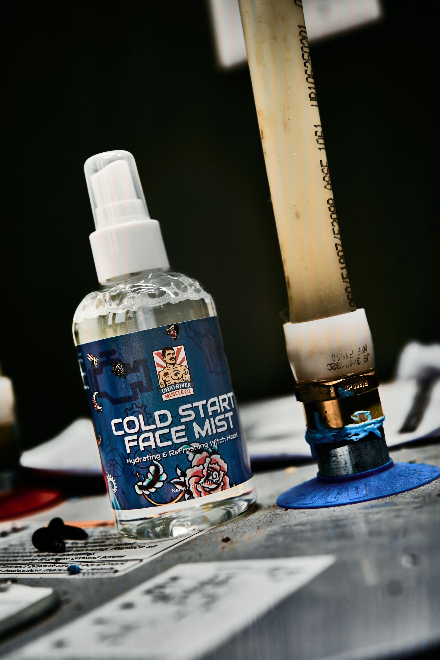
For Ohio River Muscle Co. we had one rule going in: every set starts with an ingredient from inside the product.
The peppermint coffee scrub got peppermint candy. The coffee got coffee. It sounds obvious, and it is, which is why it works. Someone scrolling past knows what the product is about before they read a word on the label.
The rules we shot by
- Only shoot what's in stock. If a customer can't buy it today, it doesn't get a set.
- Keep the raw simple. One product, one idea, clean light.
- Push the look in the edit. The brand has grit and a tattoo-flash look, and the finish has to match.
We designed the labels too, so the sets and the labels were built to sit together. That's the advantage of one team doing both: nobody has to guess what the other side meant.
One line, not a pile of products
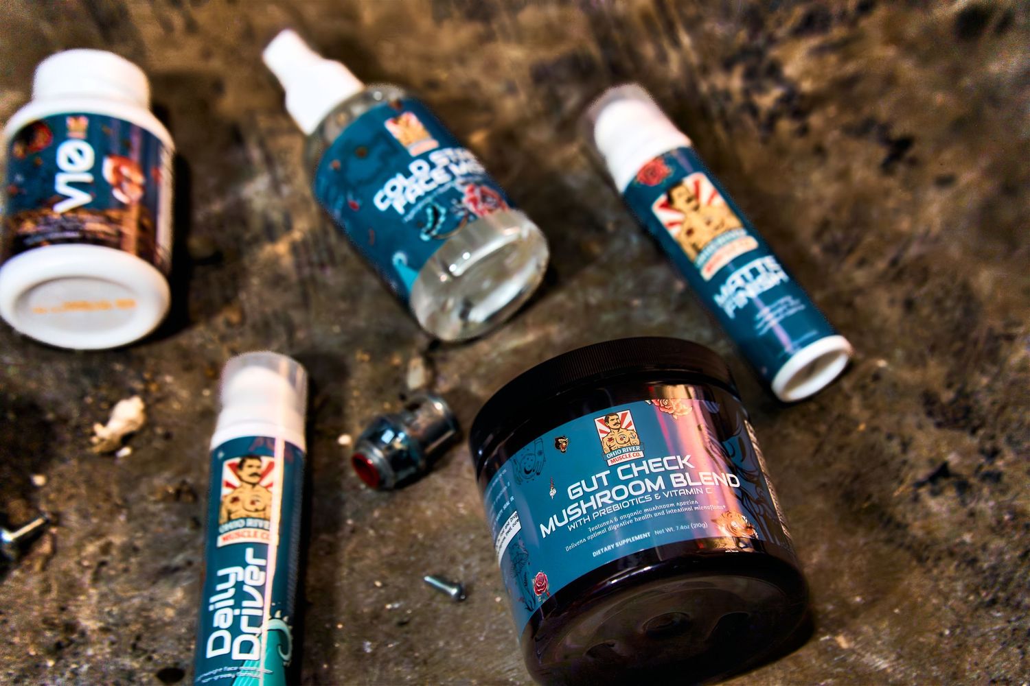
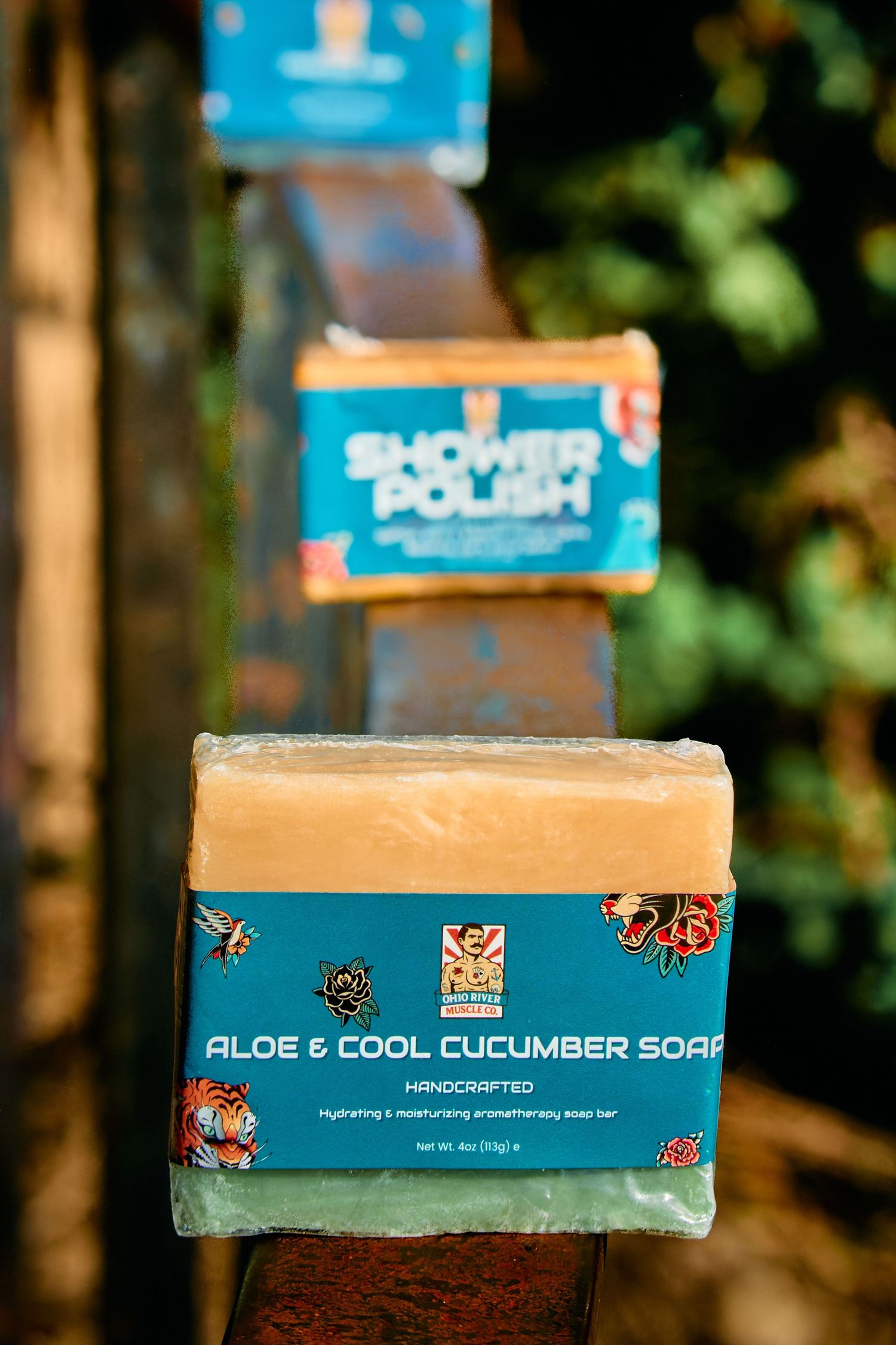
A store with products from more than one maker can start to look like a garage sale. The fix is boring and it works: the same teal on most labels, the same tattoo-flash art, the same type. A new product lands on the store looking like it was always part of the line.
The labels also had to hold up in two places at once. On a shelf they need to read from a few feet away. In a store grid they need to read at the size of a thumbnail. If the name disappears at thumbnail size, the label isn't done.
Why the ingredient trick works
Most product photos ask the viewer to read. An ingredient on the set lets them skip that step. Coffee beans say coffee. Peppermint says peppermint. The label confirms what the photo already told them, and the scroll stops a beat longer.
It also keeps the sets honest. Every prop has a reason to be there, so the photo never turns into a pile of stuff around a bottle.
See the full project: Ohio River Muscle Co. Or read about product photography.